Blog

  • Obverse and Reverse: A Network Analysis of the Roman Coins of the Two Faustinas, ca. 138-180 CE (Bonus!)

    13 October 2026

    Designed by researchers at Stanford University, Palladio allows users to visualize their data through spatial maps or network analysis with just a CSV. Since we have already worked with spatial data in this course, I focused on the network analysis tool in Palladio to enormous success.

    I elected to upload a pre-existing CSV dataset of Roman coins pulled from OCRE1 to play around with Palladio. I worked with this data spatially on a project that looked at ambiguities between Roman empresses and goddesses earlier this year2, but I have never considered examining the same data from a network analysis perspective. From a spatial vantage point, I wanted to see how far (geographically) coins of empresses Faustina the Elder (100-140 CE) and Faustina the Younger (130-145 CE) had spread across the Roman Empire. Running the OCRE coins datasets through QGIS revealed that the coins had spread significantly beyond the Italian peninsula (see map below).

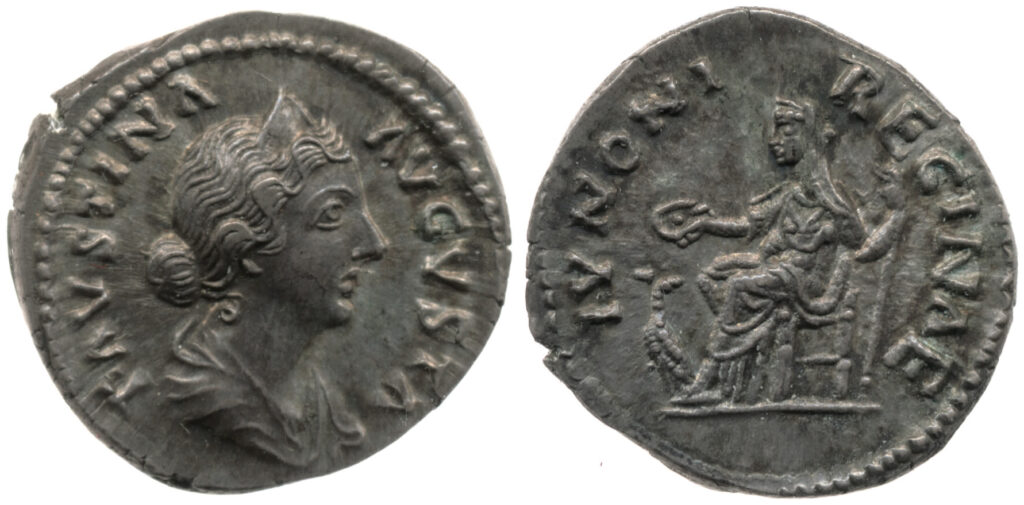
    But spatial data can only tell us so much. Running the same two datasets through Palladio’s network analysis tool allowed me to examine different aspects of the dataset in relation to one another. Particularly, I was able to plot the portrait on the obverse (the front/”head” of the coin) against the inscription on the reverse (the back/”tail” of the coin). This is significant because it allowed me to see the patterns between coins of the two Faustinas before and after they were deified3 in relation to the divine associations on the reverse of the coins. In the Roman Empire, it was common for emperors and empresses to issue coinage with their portraits (and names) on the obverse and images of gods/goddesses on the reverse–with accompanying inscriptions–to promote associations between themselves and the divine.
    Using Palladio, I had the network analysis tool map the portraits on the obverse to the inscriptions on the reverse, generating the network below for Faustina the Elder. You can see the two central nodes in the network below, where coins issued before Faustina the Elder’s deification (which occurred upon her death in 140 CE) and after are shown as separate nodes. Faustina the Elder was referred to as “Faustina Augusta” initially, and later received the title “diva” (“Diva Faustina”) after her death. She died early into her tenure as Roman empress, which is indicated by the significantly larger node for “Faustina I (Diva)” in the network. I only included coins that were definitively classified as portraits of Faustina the Elder by OCRE in this analysis, so uncertain portrait coins were not included.
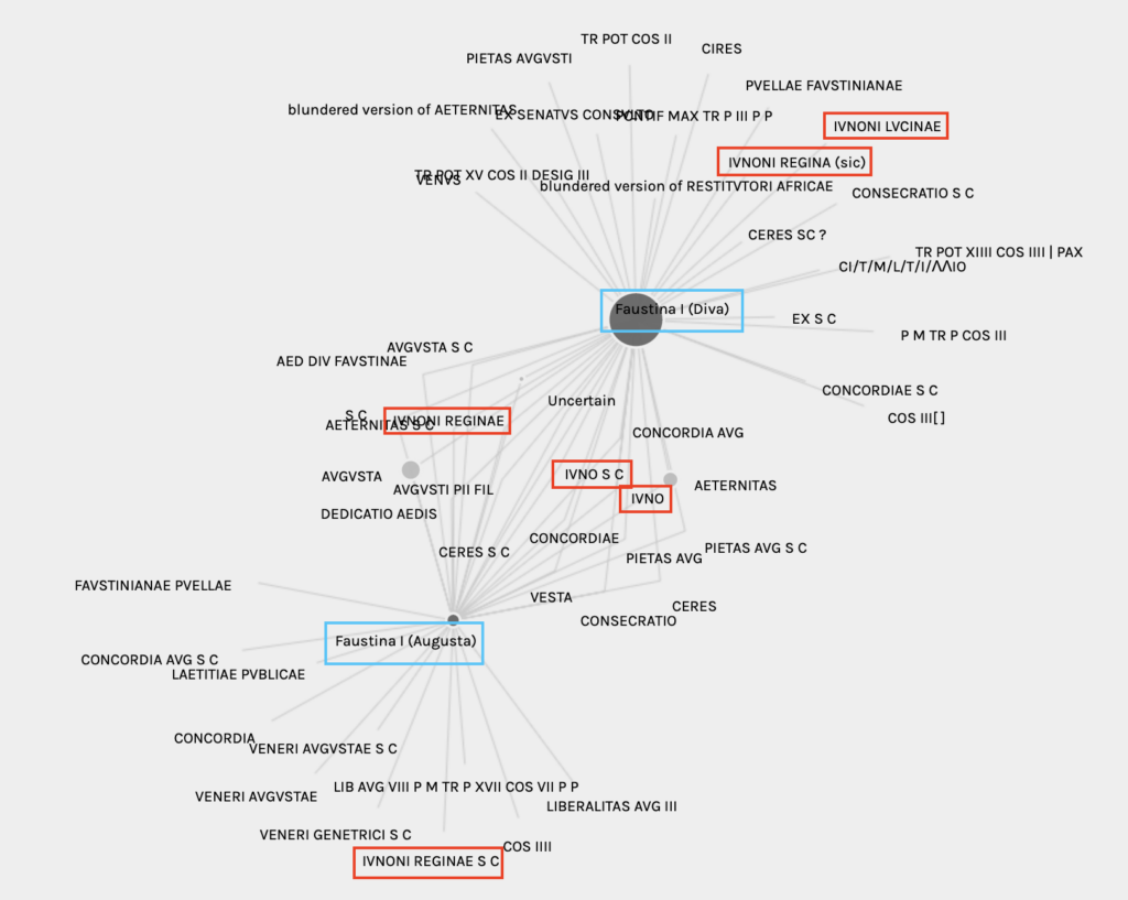
    The connecting nodes between Faustina the Elder’s two titles indicate all of the reverse inscriptions found on coins issued both pre and post-deification. Some inscriptions are unsurprising due to their frequency across Roman coinage, such as AVGVSTA S C (Augusta senatus consultum4)and AETERNITAS (eternal), but others spark potential questions. Part of my original research project that started this network analysis was examining ambiguities between the two Faustinas and the goddess Juno, and strong associations can be seen in this network analysis. All instances of Faustina the Elder coinage issued with Juno inscriptions are highlighted in red in the above network, totaling six different variations across both of Faustina the Elder’s titles. Only one inscription, IVNONI REGINAE S C, is seen exclusively in the elder Faustina’s Augusta coinage. The bulk of the Juno-related inscriptions are either shared across both Faustina the Elder’s Augusta and Diva coins, or are exclusively found on her Diva coinage. This makes sense if we remember that the elder Faustina died early into her reign with Antoninius Pius, so the vast majority of coins issued with her portrait were post-deification.

    Interestingly enough, the number of associations with specific Juno inscriptions is notably different between the Faustina Augusta and Diva Faustina coins. Filtering the network for only coins depicting Faustina Augusta on the obverse reveals that 114 of the 120 coins with IVNONI REGINAE were minted before Faustina the Elder’s death. Moreover, almost all of the coins with just IVNO or IVNO S C as the reverse inscription featured Diva Faustina portraits on the obverse, highlighting the shift in the elder Faustina’s association with Juno as a ruler to her association with Juno as a goddess.

    Reverse InscriptionCount
    IVNO1 / 17
    IVNO S C2 / 27
    IVNONI REGINAE114 / 120
    IVNONI REGINAE S C1 / 1
    IVNONI REGINA0 / 1
    IVNONI LVCINAE0 / 7
    Faustina Augusta coins
    Reverse InscriptionCount
    IVNO16 / 17
    IVNO S C25 / 27
    IVNONI REGINAE6 / 120
    IVNONI REGINAE S C 0 / 1
    IVNONI REGINA1 / 1
    IVNONI LVCINAE7 / 7
    Diva Faustina coins

    Faustina the Younger is a slightly different story. The daughter of the elder Faustina, the younger empress was alive for most of her husband’s reign so the majority of coins issued with her portrait were as Faustina Augusta, not Diva Faustina. (Faustina the Younger’s husband was Marcus Aurelius, r. 161-180 CE). She had few coins issued posthumously by her husband or successive emperors. This difference from the elder Faustina can be seen in the larger node for the “Faustina II (Augusta)” title in the network analysis below.
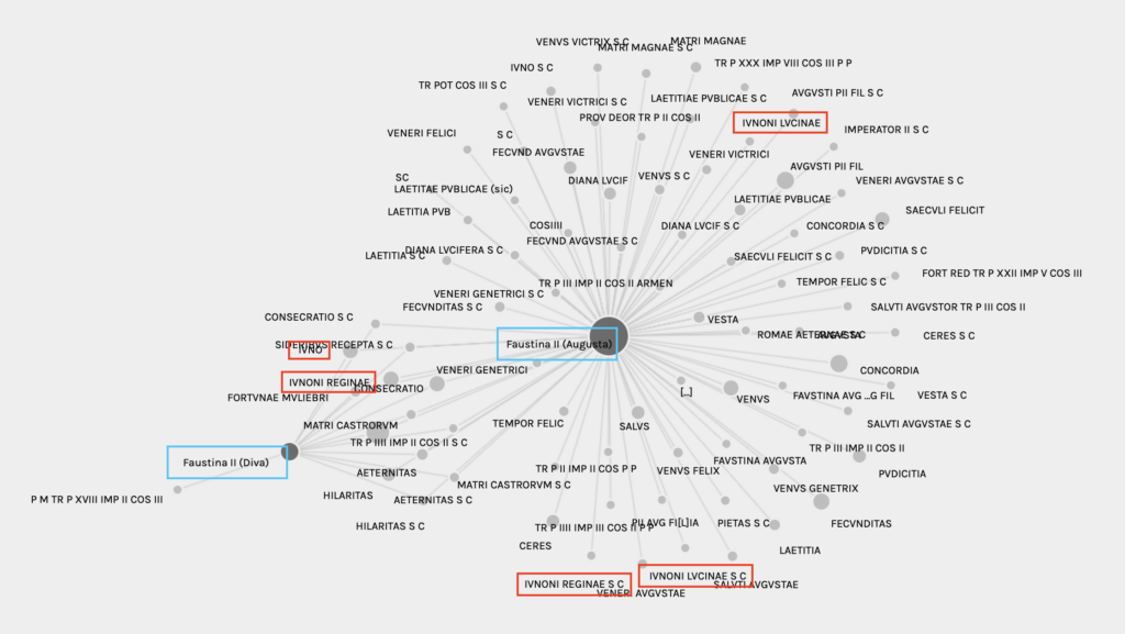
    An examination of Faustina the Younger’s network analysis also shows that the younger Faustina was associated with significantly more goddesses and titles on her reverse inscriptions than the elder Faustina was. Juno made up a much smaller overall portion of inscriptions for Faustina the Younger than Faustina the Elder, suggesting that the younger Faustina’s imperial image was not as concise or universal as her mother’s.


    Issues & Future Implications

    As amazing as Palladio seems to be to work with, it isn’t without its issues. My biggest complaint about the platform is the lack of maneuverability in the network analysis tool. Palladio generates the network from a user’s dataset, but doesn’t actually allow them to manipulate the network once it is generated. Users can zoom in and out for better visualization, but there isn’t a way to rearrange the nodes. Moreover, Palladio doesn’t currently have image download capabilities, so users have to screenshot their networks rather than download them as a JPEG, PNG, etc. Since the networks can’t be manipulated, screenshots often have to prioritize capturing the entire network over readability–as evidenced in my networks above which have some overlapping node labels.

    Looking forward, I would like to generate a network for the two Faustinas and the goddesses represented on the reverse of the coins to see if certain goddesses are more common than others. This would require a more significant cleaning of my preexisting datasets, which I didn’t have the time to do for this week’s assignment. OCRE doesn’t have a field in its downloadable data dedicated to the portrait/image on the coin’s reverse, so I would have to generate that myself. There is a reverse description field, but that is far too many words and far too specific for each coin to be put in a network right now. The reverse inscriptions have been a good substitute in the meantime, since they suggest the image on the reverse of the coin.

    1. OCRE: Online Coins of the Roman Empire, accessible at https://numismatics.org/ocre/. A similar database also exists for coins of the Roman Republic (Online Coins of the Roman Republic, CRRO, accessible at https://numismatics.org/crro/). ↩︎
    2. See “Between Goddess and Empress: Iconographic Ambiguities in a Roman Provincial Bronze” under “Research and Projects” tab. ↩︎
    3. It was common practice in the Roman Empire to deify emperors and empresses after their deaths, elevating them to the status of gods. These titles were often accompanied by official cult worship, such as the cult of Augustus or Temple of Septimius Severus at Djemlia. ↩︎
    4. S.C. = senatus consultum: by decree of the [Roman] Senate. S.C. is commonly seen on Roman coins. ↩︎
  • “Upstream Annotations” and Data Standardization: Strengthening the Foundation of IIIF Image Annotations

    4 October 2026

    For this week’s blog post I decided to dig into Matthew J. Westerby’s “Annotating Upstream: Digital Scholars, Art History, and the Interoperable Image” (2024)1. Westerby is the Digital Research Officer at the Center for Advanced Study in the Visual Arts (CASVA, National Gallery of Art, Washington D.C.). He works predominately in digital resources and linked-data, and his art historical work has concentrated in medieval and early modern illuminated manuscripts. Prior to taking on his current role as Digital Research Officer, Westerby also served as a postdoctoral fellow at CASVA in digital projects.

    International Image Interoperability Framework, or IIIF, is a standardized application programming interface (API) that allows a user to link additional context about an image to the image’s metadata for viewing online2. IIIF data is intended to make it easier for online users to manipulate images by editing the display of the digital object through viewpoints (i.e. zoom level) or annotations. According to IIIF, images with linked IIIF data can be viewed through specialized IIIF viewers such as Annona. Without digital viewers programmed to access attached IIIF data, a user cannot view any annotations or other edits made to the digital image.

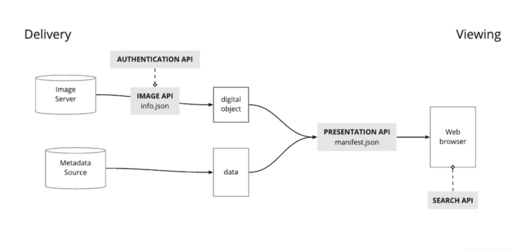
    I’ll be completely honest here, IIIF still confuses me to a certain extent. I consider myself more programming and data-forward than many in the field of art history due in part to my library science background, but many aspects of IIIF still go over my head. The diagram below from IIIF’s website helped me understand the connection to a digital image’s metadata (the lower flow), and I understand how linking the image metadata and the IIIF data works in theory. I’m not sure how a program like Annona pulls the IIIF data (how is the programming different?), nor do I fully understand how the two data files (the image metadata and the IIIF data) are linked. I would probably have to do a deep-dive into an image’s IIIF JSON file to see the linking process.

    Westerby’s article focuses on annotations in IIIF data which allow researchers to add additional context to digital images in public-facing projects. He cites the Digital Mappa platform as one that has the capacity for IIIF annotations. Westerby argues that it is beneficial for digital art historians to re-use base-level metadata about objects in IIIF data. In the instance of Orazio Gentileschi’s The Lute Player that Westerby uses, this “base-level” metadata is the public domain description of the artwork generated by the painting’s owner (the National Gallery of Art). This description forms the basis of Westerby’s IIIF annotations, allowing him to link words in the description to their visual counterparts in Gentileschi’s painting.

    “Upstream Annotations” and the Standardization of Annotation Data

    The use of public domain descriptions is foundation of what Westerby refers to as “upstream annotations”. Rather than individual art historians and digital scholars generating their own IIIF annotations from scratch, Westerby argues for common resources to form the basis of IIIF annotations. If everyone starts from the same point (i.e. a public domain description of a painting), IIIF annotations can be better preserved and easier to access for more users. Westerby hopes that researchers generating IIIF annotations will be open to not only sharing those annotations publicly via open-source platforms like the Internet Archive, but that “upstream annotations” will also encourage researchers to be more intentional about their data creation.

    Those who work with data know that the data-creation quality can vary drastically depending on who is going to use the data in the long term. I know that I have occasionally let my good data practices slip when I know that a particular dataset will only ever be used by me. If no one else ever sees the data, does it matter that it’s not perfect?

    Westerby isn’t arguing for perfection in his article, just good practice. Data works best when it is standardized, that’s why library cataloging adheres to MARC 21 or RDA standards and there are widely-accepted best practices when working with spatial datasets. Standardized data is easier to search, easier to share, and ultimately easier to maintain. Westerby wants the starting point for the IIIF annotation data to be standardized and freely accessible, therefore ensuring the foundation of IIIF annotations is rock-solid. Institutions like the National Gallery of Art can promote best data practices by ensuring the starting point for users’ data projects is as seamless as can be.


    Video Transcript Annotations

    In addition to this week’s blog post, my class was also challenged to edit an auto-generated transcript using Panopto. For those unfamiliar, Panopto is a video content management platform commonly used by companies and universities like UNC Chapel Hill. Like other video platforms such as YouTube, Panopto auto-generates transcripts from videos using artificial intelligence. While oftentimes a solid baseline for improving accessibility, these transcripts can vary in accuracy to the video’s audio. I’ve edited transcripts in Panopto a bit in the past for work, and I’ve noticed that the auto-generated transcripts can struggle with speakers that have heavier accents (when the audio is in English as that’s all I’ve worked with) and with those who tend to talk faster or slur words together. As someone who grew up in and lives in the southeastern U.S., these traits are common amongst speakers with southern accents.

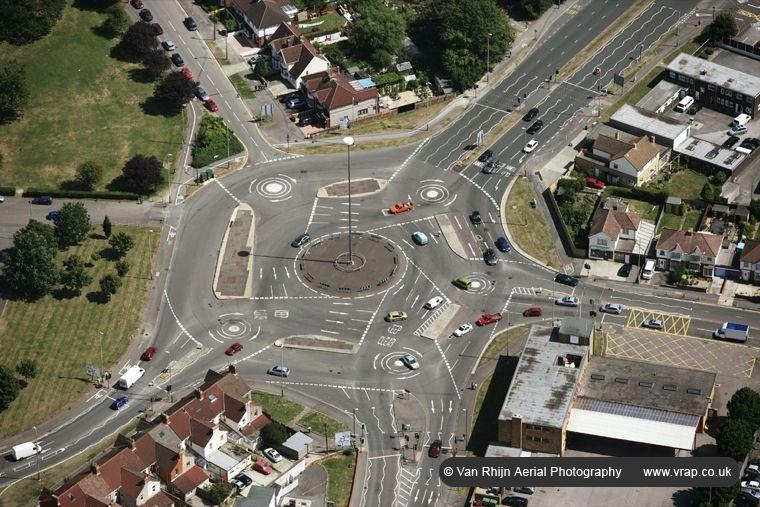
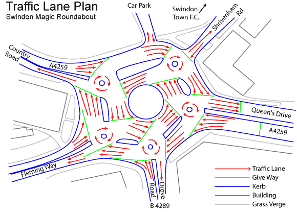
    The video I elected to transcribe is one from a vacation I took a couple of years back. My family and I spent a week in the UK and one of our first stops in our rental car was the so-called “Magic Roundabout” in Swindon, UK. While I am the roundabout’s number one fan when it comes to urban planning, the Swindon Magic Roundabout is an absolute chaotic mess of traffic intersection design to my American eyes. I first learned about this intersection years ago from a Tumblr post, and my driving-enthusiast dad decided to make it his personal challenge to conquer the Magic Roundabout. In the middle of the evening rush. While driving a right-hand car. Enjoy what was at least his third attempt.

    1. Matthew J. Westerby, “Annotating Upstream: Digital Scholars, Art History, and the Interoperable Image,” Open Library of Humanities Journal, vol. 10, no. 2 (2024) ↩︎
    2. https://library.stanford.edu/iiif ↩︎

  • Third & Fourth Style Pompeian Wall Painting: A Spatial Analysis Using Google My Maps (Bonus!)

    2 October 2026

    Bonus post!

    As part of our unit on spatial data our class was tasked with creating our own maps in Google My Maps. I was originally going to use the map I started last week on Pierre-Jacques Volaire’s paintings of Vesuvius, but I realized that my project didn’t warrant spatial analysis on the scale this assignment required. I had intended to map the different vantage points from which Vesuvius was painted from in the late eighteenth and early nineteenth centuries, but I didn’t have a large enough sample dataset beyond Volaire to comprehensively achieve that. (Volaire painted from approximately four different locations from 1767-1799).

    Pivoting, I instead elected to return to my roots: Pompeii.

    I decided to use a dataset that already existed for this Google My Maps project, so I downloaded the data from my Roman Wall Painting Index (RWPI) collection. As of writing, there are approximately sixty paintings uploaded onto the site, representing a small fraction of Roman wall painting still in existence. My goal was to do the opposite of the RWPI: represent this corpus of wall painting spatially rather than thematically. Of course, there are already a number of sources that organize Roman wall painting by find spot including PompeiiInPictures and Pompei: Pitture e Mosaici (1990-2003), so this is by no means a new idea.

    My goal was to map the paintings by wall painting style—an organizing system originally developed by archaeologist August Mau in the nineteenth century. Mau’s system sorted Roman wall painting into four categories based on their subject content, which roughly aligned with the periods in which they were painted. Mau argued for a linear development of wall painting, from the masonry style that mimicked real wall materials like marble that was popular in the 3rd-1st centuries BCE to the more intricate figural and architectural styles popular in the 1st century CE. For a more detailed timeline with examples, see here–>.

    StyleTitleDatesNotes
    FirstEncrustation style150-80 BCE
    SecondArchitectural style80 BCE-14 CEEnd date denoted by death of Augustus (14 CE)
    ThirdOrnamental style14-62 CEEnd date denoted by earthquake of 62 CE
    FourthIntricate style62-79 CEEnd date denoted by eruption of Vesuvius

    The downloadable version of the RWPI data lacks spatial data, so I had to manually add that into the CSV before uploading it to Google My Maps. The find spot is listed in the data, so I went to Google Maps and pulled coordinates for the buildings that are tagged on Google (i.e. the House of the Vettii/Casa dei Vettii). For the lesser-known buildings (especially those that are not publicly accessible in the archaeological park), I had to reference published maps of Pompeii and compare it to traditional Google Maps.

    This was the first major flaw of Google My Maps that I ran into. In other spatial data programs (i.e. ArcGIS Pro or QGIS), I would normally georeference a map imported into the software as a raster layer, allowing me to line up the image with its actual location on earth. Google My Maps doesn’t have the capability for georeferencing or importing raster layers, so I had to pull the coordinates the old-fashioned way.

    One the paintings had spatial data, I uploaded the dataset into Google My Maps directly as a Google Sheets. You can also upload data as a CSV, but the dataset I was working with was already in Sheets format—and I don’t plan to do anything else with it—so I just kept it in G-Suite. I did have to manually split the RWPI data into two smaller datasets based on the wall painting style identified in the data, which was a little annoying. Since I intended to have two layers in my map (a “Third” and a “Fourth” style layer), I needed to upload two separate datasets into Google My Maps. For third style, see here–>. For fourth style, see here–>.

    Once the paintings were placed in the map, I also went through and manually drew polygons for each of the nine regions (regio, sg.) used in the standard organization of Pompeii. Once again, Google My Maps didn’t allow for georeferencing, so I had to manually reference a map of Pompeii using one available on PompeiiInPictures. I matched up the street names within the archaeological park to the ones available on the reference map, getting the polygons as close as I could.


    My map is visually appealing but analytically insignificant. The blue points represent the Third Style paintings and the red points are Fourth Style. From an initial glance at the map, there doesn’t seem to be a significant spatial distribution difference between the wall painting styles across the cities. The majority of paintings are concentrated in the northwestern part of the city, in regions VI and VII. There are some examples of third style farther east in regions V, IX, and I, but these are few and far between.

    Much of the spatial distribution is limited by the relative incompleteness of the RWPI dataset. As of download, there are only approximately sixty paintings catalogued, which is a small subset of the total amount of wall painting that exists. The dataset is intentionally skewed towards third and fourth style painting as well, partly due to the goals of the RWPI (to catalogue figural subjects of paintings, which emerged in early third style) and the relative scarcity of earlier styles due to age. Many earlier paintings were replaced over time as tastes changed.

    Many buildings in Pompeii were renovated after the earthquake that struck the region in 62 CE, leading to the seemingly large amount of late third and fourth style painting that existed at the eruption of Vesuvius in 79 CE. Moreover, the buildings in the northwestern parts of Pompeii were generally newer and owned by wealthier individuals in the city, further contributing to the larger proportion of newer painting styles present there. The western regions are also completely excavated, whereas the eastern regions of IV, V, IX, and III are still partially, if not mostly, unexcavated. New discoveries coming out of Regio IX have revealed numerous later style paintings, suggesting they are also present in large quantities there.

    If the goal of my map was to see where wealth was in Pompeii, and we’re determining wealth by the presence of the most fashionable wall paintings of the time, my map would suggest that wealth is concentrated in the northwestern regions of the city. But my dataset is incomplete, and very skewed towards a certain part of the city, so maybe the presence of later styles of wall painting isn’t a great metric to understand wealth distribution in Pompeii.

  • Spatial Data: the Ole Faithful of Digital Humanities Projects

    27 September 2026

    This week we turned our attention in class towards a specific type of data: spatial data. I was already incredibly familiar with spatial data and its myriad of uses in the humanities because I have a minor in geographic information systems (GIS) from undergrad. I also currently work as a library data consultant for the Digital Research Services department at UNC Library, so I am more than familiar with spatial data platforms like ArcGIS Pro, QGIS (my beloved!), and ArcGIS Online. With this said, I love working with spatial data and I think it’s an excellent tool to be applied in the humanities.

    One of the articles we read this was Beatrice Joyeaux-Prunel’s Digital Humanities for a Spatial, Global, and Social History of Art (2020)1. Joyeaux-Prunel is professor and the chair of Digital Humanities at the University of Geneva. She has worked on and managed numerous digital projects, including the Artlas Project, Postdigital, and VISUAL CONTAGIONS. Her 2020 article focuses on the development of cartographic digital humanities projects as she argues for the use of spatial data in art history.

    My favorite part of Joyeaux-Prunel’s article–and the part I find to be most compelling–is her claim that “mapping is a research process rather than an outcome”2. I find that too many digital tools in the digital humanities focus more on presenting the outcome of a research process than actually embedding themselves in that research process. While I am a strong believer in increased accessibility for academic research–and digital tools contribute to that increased accessibility greatly–Joyeaux Prunel argues that spatial data should be incorporated as a part of the art historical research process, not only as a product of it.

    Take Google Maps and StoryMaps JS as an example of part versus product. As a part of this week’s class, we were introduced to the two spatial mapping platforms commonly used in humanities projects. I found that both of these platforms were fairly easy to use and designed for beginners working with spatial data. All you need to start a map in Google My Maps and StoryMaps JS is a known location–either one that is already marked on Google Maps (StoryMaps JS is based on the same satellite information used by Google Maps) or the coordinates of a particular point.

    I elected to use coordinates for my two test maps since I was working with locations that no longer exist for the most part. My two test maps (both embedded below) include the same four locations around the city of Naples, Italy that pertain to my current master’s thesis project. I am working on paintings of Mount Vesuvius in eruption from the late eighteenth-century by French painter Pierre-Jacques Volaire. Volaire’s work can be roughly categorized into three-to-four groups based on the eruption they are based on and the location they depict Vesuvius from. These four locations are as follows: the Ponte della Maddalena (since destroyed), the Atrio del Cavallo, the Castel dell’Ovo, and the Strada della Marinella in the Piazza al Ponte della Maddalena (since destroyed).

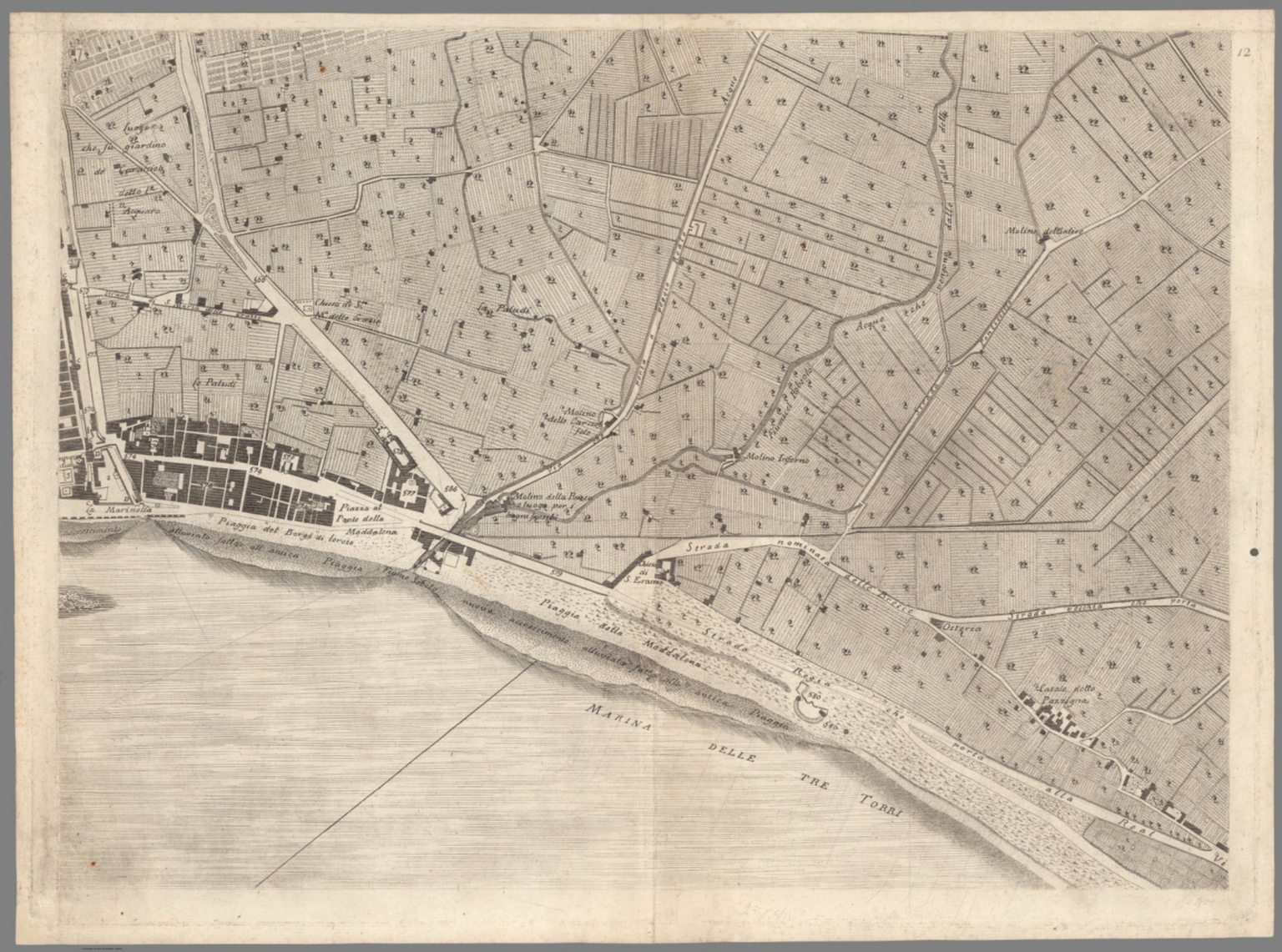
    Two of these four locations no longer exist in the modern era and were located via a map of Naples published by Niccolò Carletti (1723-1796) in Mappa Topografica della Città di Napoli e de’ suoi Contorni (1776). The map is uploaded to the Davis Rumsey Map Collection and georeferenced via crowdsourcing3, so it was easy to match the original location of the Ponte della Maddalena to the now aptly-named Via Ponte della Maddalena. From there I collected the coordinates of the now-destroyed bridge and adjoining piazza from Google Maps (not to be confused with the Google My Maps I was creating at this time).

    Link to Google My Maps: here-> (embedded below)
    Link to StoryMap: here-> (embedded below)

    Having now used both spatial mapping platforms to perform the same function, I find that I prefer Google My Maps to StoryMapsJS. I think StoryMapsJS are a great way to tell a story using spatial data, especially to a more public audience that may not be familiar with humanities fields or spatial data. That said, I am more interested in using spatial data for analysis purposes, which StoryMapsJS just isn’t designed for. For my thesis project, I am working to recreate the different vantage points of Vesuvius in eruption, so I need a data platform that allows for more data manipulation than visualization.

    While an excellent tool in communication, StoryMapsJS is not designed to be integrated into the research process. Its design lacks the capacity for deeper analysis beyond visualization. StoryMapsJS JS is meant to show research spatially, not be an active part of it. Google My Maps on the other hand is positioned slightly better to serve as an active part of the research analysis process. Unlike StoryMapsJS, users in Google My Maps can search for locations using satellite imagery and click on the map to pull up specific coordinates. This is better suited for locations that aren’t marked on traditional Google Maps or those that no longer exist, like the Ponte della Maddalena. StoryMapsJS allows users to place points using coordinates, but those coordinates have to be sourced from another location outside of the platform.

    All this said, Google My Maps still pales in comparison to actual spatial data software programs like ArcGIS Pro and QGIS for spatial analysis. A user can place points in Google My Maps to visually see spatial information, but there is little other analysis that can be done beyond that. One needs to make the jump to another platform for more in-depth analysis, which requires significant training and oftentimes expensive licenses4. ArcGIS Online is a common middle-ground for users looking for more analytical power than Google My Maps, but don’t need something as powerful as ArcGIS Pro or QGIS.

    1. Beatrice Joyeux-Prunel, “Digital Humanities for a Spatial, Global, and Social History of Art,” The Routledge Companion, pp. 88-108. ↩︎
    2. Joyeaux-Prunel (2020): 94. ↩︎
    3. Pignatelli, Giovanni. Mappa Topografica della Città di Napoli e de’ suoi Contorni. Napoli, 1775. 1:4000. https://davidrumsey.oldmapsonline.org/maps/6498aba9-17b7-53a8-98bb-adc26a2fa9ef/view. ↩︎
    4. ArcGIS Pro and ArcGIS Online are both owned by ESRI and required a license. UNC users get free access to ESRI products through their university accounts. A personal license is currently $100/year USD. QGIS is open-source and free to download for any user. ↩︎

  • Let’s Talk About Data Inequities: the Mapping Senufo Project

    20 September 2026

    Data can be hard. It’s tedious to collect and oftentimes difficult to work with, existing only as numbers or text strings that seemingly have no true meaning. One mishap in the data-collecting process can spell disaster for the project overall, leading to errors and readability issues.

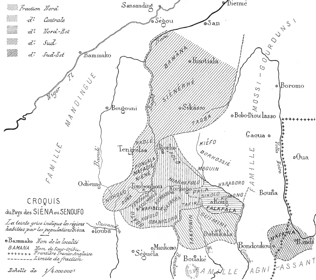
    For this week’s blog post, I decided to analyze Susan Elizabeth Gagliardi and Constantine Petridis’ “Mapping Senufo: Making Visible Debatable Information and Situated Knowledge” (2022)1 because I found that the authors ran into a lot of the same issues in their data-collecting process that I have in the past. Gagliardi and Petridis’ article stems from a project undertaken at the Art Institute of Chicago, Mapping Senufo: Art, Evidence, and the Production of Knowledge. Originally started in 2020, the project sought to examine traditional arts hailing from Western Africa that have been identified as Senufo–a family of languages from what is today Burkina Faso, Côte d’Ivoire, and Mali.

    Map of Senufo area in 2026 via Google Maps

    Senufo-associated objects first entered Western museum collections beginning in the early twentieth century. As Europeans explored the region of Western Africa, they wrote home of the works of art from the region2. In doing so, visiting Europeans grouped together all of these objects from different cultures under the Senufo label, stripping them of their original cultural contexts. The Mapping Senufo project aimed to re-associate “Senufo” objects with their original geographic locations, therefore returning them to the cultures that once created them.

    While a simple idea in theory, the Mapping Senufo project was immediately met with roadblocks. Many of the Senufo objects lacked complete provenance records–a product of the methods oftentimes used by Europeans to remove African objects from their homes. For the objects that did have any kind of known geographic origin, researchers on the projects ran into name discrepancies. Small villages oftentimes had different names over time, and the names attributed to these villages were different to the Europeans who removed the objects than they were to locals who lived there.

    Compiling and Populating the Mapping Senufo Database

    Researchers at the Art Institute of Chicago started the Mapping Senufo database by creating a descriptive schema. This standardized form would be used by researchers to input the metadata (the data about the individual objects) into the database on a consistent basis, reducing the possibility of database errors. The data was sourced from the Art Institute of Chicago’s collections management system (CMS)–the digital system that kept catalogued information about the museum’s objects. A CMS is typically organized around a series of required built-in fields, such as Title [of work], Artist, Medium, and Date.

    While the Senufo objects in the Art Institute of Chicago’s CMS have all of these required fields since they are necessary to input a record into the database, the fields are not well-suited for objects like the Senufo ones. Fields are designed around the collections sourcing from Western art movements like the Renaissance and more modern periods. Works from these periods of art typically have a relatively complete “tombstone” (as Gagliardi and Petridis refer to these required fields as) due to their more-complete provenance histories. Moreover, the Western works of art that these collections management systems are based on traditionally already have all of the tombstone elements a CMS needs. Paintings from the eighteenth-century usually have documented and attributed artists, as well as artist-assigned titles. Scholars are generally fairly certain about a work’s date of creation, allowing them to assign a painting a specific year of production.

    Issues With Inequities in Descriptive Schemas

    For objects outside of the “standard” Western art canon, this system does not fit. Information about objects in the Senufo collection is more uncertain. Scholars and curators do not always know where an object originates from or how to came to the museum. In many cases the provenance for objects like those in the Senufo collection is simply the year the object was acquired by the museum. This lack of information makes it incredibly difficult to fit the Senufo objects–and any objects outside of the Western art canon from the last few centuries–into the fields the Mapping Senufo projects needs to include.

    When creating a database descriptive schema, there have to be a series of required fields. Without these fields the database cannot be searched and there is no way to link objects together. Some of these fields are designed to be completely unique and arbitrary, such as a museum accession number (a unique ID). However, many others will ultimately be duplicate fields–especially if information is unknown. For example, a collection holding two different works by the same artist will generate two results when searched by artist name. In this case, there is not a significant issue in the search-ability of the dataset since users may look for all works in the collection by the a single artist. But, issues arise when fields like Title [of work] and Date are non-specific and when there is conflicting information.

    Gagliardi and Petridis note in their article the issues surrounding the title and identification of many of the objects in the Senufo collection. Many objects have no set title and were not always associated with the Senufo region, making them almost impossible to track in auction and private records before arriving at a museum. An object known as “Senufo mask” in 2026 may have been sold at an auction as “West African mask” or “[Specific tribe] mask” in 1960. Without images–and many auction catalogs before the 1990s did not publish images for all lots in a sale–it would be nearly impossible to link these two records to the same object.

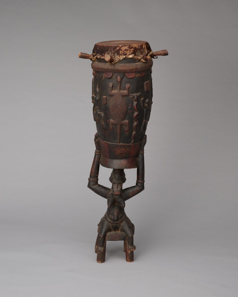
    Female Caryatid Drum (Pinge)
    Senufo, 1990.137
    c. 1930-1950
    Côte d’Ivoire (Object made in)
    Wood, hide, and pigment
    125.8 × 50.8 × 50.8 cm (49 1/2 × 20 × 20 in.)

    Provenance: Charles Ratton (died 1986), Paris, by 1957 [see Cannes, Arts D’Afrique et D’Oceanie, 1957; Senufo Sculpture from West Africa, 1963; Goldwater, 1964, no. 165]; sold to Harry A. Franklin (died 1983), Harry A. Franklin Family Collection, Beverly Hills, Calif., early 1960s [personal communication from Valerie Franklin 2/26/2014]; by descent to Valerie Franklin, to 1990 [see Marie-Therese Brincard, 1990, p. 103]; sold, Sotheby’s, New York, Apr. 21, 1990, The Harry A. Franklin Family Collection of African Art, lot 47, as A Senufo Memorial Drum, to the Art Institute, 1990.

    Note the change in name from 1990 sale to 2026.

    The lack of provenance as exemplified above is just one of the reasons it is difficult to place Senufo objects in the Mapping Senufo database. By what name do researchers refer to objects in their collection? Should they prioritize the oldest known name, even if it might be misleading or incorrect? Or should researchers prioritize the most recent name of an object–even if it too may be misleading or incorrect. For the Mapping Senufo objects, the entire goal of the project is to identify if the objects are in fact “Senufo“; how can researchers do that if the data they are starting with is inaccurate to begin with?


    Turning towards the types of data that we examined in class this week, I am particularly interested in working more with spatial data—which we have not covered in detail yet. I have a minor in geographic information systems (GIS) from undergrad, so working with spatial data is kind of my bread and butter. That said, I do not actually get to work with spatial data on art history-related projects very often, so I am interested in bringing that component to my own research.

    Looking ahead in the semester, I considering seeing if I can map out some of the paintings of Mount Vesuvius that I am working with for my master’s thesis. The works depict Vesuvius in eruption from a variety of different angles (most grouped into three main vantage points). Not sure how useful of a digital project this would be for the general public, but it would probably be helpful in wrangling together the 70+ paintings by a single artist that I am examining.

    (I started putting together some of the Vesuvius paintings in my CollectionBuilder assignment for this week, which can be viewed here–>).

    1. Susan Elizabeth Gagliardi and Constantine Petridis, “Mapping Senufo: Making Visible Debatable Information and Situated Knowledge,” in Perspectives on Data, ed. Emily Lew Fry and Erin Canning (Art Institute of Chicago, 2022). ↩︎
    2. Gagliardi and Petridis, 2022, n.p. ↩︎
  • Digital Art History Platforms: Omeka and CollectionBuilder

    13 September 2026

    For this week’s blog post I elected to review Lauren G. Kilroy-Ewbank’s article, “Doing Digital Art History in a Pre-Columbian Art Survey Class: Creating an Omeka Exhibition Around the Mixtec Codex Zouche-Nuttall” (2018)1. I was unfamiliar with Omeka as a digital collections platform prior to reading this article, so I found that Kilroy-Ewbank did an excellent job explaining the tool through her collegiate user-case scenario. (For more on Omeka, see here–>). 

    As of the publication of this article, Lauren G. Kilroy-Ewbank was a professor of art history at Pepperdine University. She specialized in the visual culture of Latin America from 1400-1800, the decolonization of art history, and digital art history (DAH) pedagogy. Kilroy-Ewbank left academia in 2020 and currently serves as one of the co-founders of ARTSQ, an online platform dedicated to making art and history more accessible to K-12 students. 

    The Omeka project detailed throughout this article focuses on reading the visual language of the Codex Zouche-Nutall (CZN). Students in Kilroy-Ewbank’s art history course were tasked with building Omeka sites to serve as a visual argument for their analysis of the CZN imagery, taking the place of a traditional formal research paper. Students developed their arguments from materials learned in class before turning to Omeka, using the digital collection platform as a way of communicating their research to a non-academic audience. 


    Metadata: Data About Data

    Kilroy-Ewbank stressed the importance of proper metadata throughout her article, emphasizing that it was the backbone her students’ success with Omeka. This can be difficult to convey to art history students who may be unfamiliar working with data and metadata (data about data), as Omeka uses user-assigned metadata and tags to build the digital collection. Without thorough metadata, Omeka can’t build a system. 

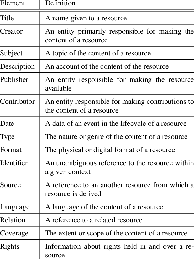
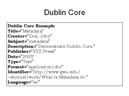
    Omeka runs on DublinCore, so users are required to have some familiarity with the cataloging system before diving into the platform. Luckily, DublinCore is fairly straightforward compared to other systems like MARC21, and is very adaptable to visual images. Kilroy-Ewbank devoted an entire class period to walking her students through Omeka and DublinCore, providing them a foundation to build upon rather than simply throwing her students into the deep end. While I have never used Omeka myself, it seems that their online documentation is fairly robust, furthering supporting the students. 


    Concerns Regarding DAH Tools

    One concern that has arisen from Kilroy-Ewbank’s article is the long-term stability and accessibility of the CZN Omeka projects after the course ends. Unlike traditional publications, digital tools are not static and they are at risk of decaying over time if they are not properly maintained. Software updates push older versions of platforms out-of-date, rendering them practically unusable over time. Some digital platforms are tied to student university accounts, which many students lose access to after graduation. In the event that projects in the aforementioned situation require updates, there is no way for a user to provide them. 

    I am unsure of the exact backend process that goes into creating an Omeka project, but I assume it is heavily reliant on developer programming to run. DAH tools like Omeka often provide the programming needed to start an online platform so users do not have to generate it themselves. While this lowers the barrier of entry for many users who otherwise are not familiar with programming, it creates a reliance on faceless creators to keep the tools operating. If the developer decides to kill the program or stop providing updates, the projects associate with it will cease to exist. 

    Conclusions

    What struck me the most in this article was Kilroy-Ewbank’s emphasis on DAH projects not being perfect, as I have worked in DAH in the past and always been concerned about issues with my projects. DAH tools are new and still developing technologically, so they are prone to errors and bugs. Moreover, I find that may digital tools have confusing documentation (if any at all), making it more difficult to solve issues as they arise. For example, ESRI—the parent company of ArcGIS Pro and ArcGIS Online—has relatively poor documentation in my opinion. Their page is difficult to search and links are buried in individual webpages, making it incredibly frustrating to comb through. 

    Kilroy-Ewbank acknowledges in her article that her students will likely struggle with Omeka, and seems completely okay with that struggle. What seems to matter most to Kilroy-Ewbank is that the students attempt the platform and try to think about supporting an argument visually, rather than through a research paper. For professors like Kilroy-Ewbank, tools like Omeka are meant to act as an alternative to the traditional research paper. DAH tools are oftentimes more accessible to non-academics, as they aren’t hidden behind journal paywalls and use more accessible language.

    Even if the Omeka projects are unsuccessful, Kilroy-Ewbank seems prepared to congratulate her students on a job well done. Sometimes it is the process of learning that is more important than the final product.


    Turning away from Omeka, our class had the opportunity to interact with another online digital collections platform this week: CollectionBuilder. Similar to Omeka, CollectionBuilder is an online tool that allows users to curate their own collection of visual and auditory media (images, videos, .mp3 files, etc.). It was designed specifically for digital humanities projects by a team at the University of Idaho.

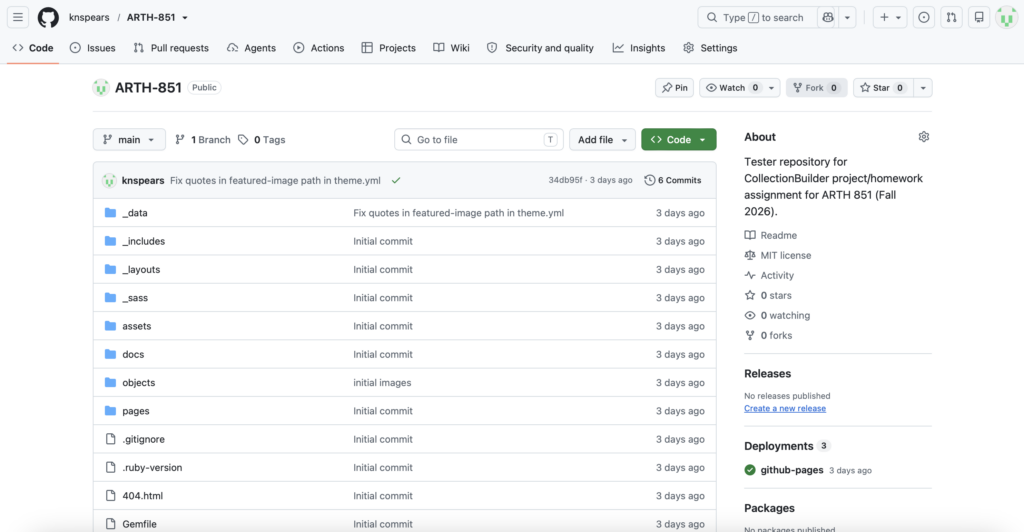
    CollectionBuilder’s barrier to entry is fairly low for users unfamiliar with programming. Sites are maintained through a Github repository, which users copy directly from CollectionBuilder itself. The developers provide users with pre-populated Google Sheets to fill with their data, highlighting necessary fields (i.e. ‘Title’, ‘Object_ID’). The cataloging system is based on DublinCore, with a few modifications. Users have the option to populate the pre-formatted Google Sheet and create a basic webpage, or dig into the code in the Github repository for further modifications and customization.


    I was actually very familiar with CollectionBuilder coming into this week’s classes, as I used it in a final project in another class this past spring. Since I have experience with programming languages, I elected to modify the code and templates provided by CollectionBuilder to better suit the needs of my project. I am by no means a software engineer or a computer scientist, but even I found that CollectionBuilder’s documentation was fantastic for walking users through modifications and adjustments to their sites. The documentation is also very good for simply setting up a basic site—no modifications needed.

    (The project I used CollectionBuilder for was the Roman Wall Painting Index (RWPI), an online database of Roman wall paintings organized by subject and theme. Traditionally, Roman wall painting has been organized by geographic find spot, making it difficult to compare paintings across different locations. The RWPI was designed to provide a visual alternative to traditional means of organization for researchers. It is still being updated as of writing and currently represents a small number of total wall painting. You can access the site here–> or under the Research & Projects tab.)

    1. Lauren G. Kilroy-Ewbank, “Doing Digital Art History in a Pre-Columbian Art Survey Class: Creating an Omeka Exhibition Around the Mixtec Codex Zouche-Nuttall,” Journal of Interactive Technology and Pedagogy, no. 12 (February 2018) ↩︎
  • Online Collections Usability: Searching Versus Browsing

    6 September 2026

    It is no surprise that the global rise of the Internet since the late 1990s has ushered in the era of online, digitized collections from art museums around the world. From the expansive collections housed at the Metropolitan Museum of Art in New York and the Louvre in Paris to the comparatively smaller collections housed at institutions such as the Ackland Art Museum in Chapel Hill, NC, art museums have increasingly digitized their collections to make them more accessible to the public. But are these collections really more accessible? Who is the “public” that are using these online collections? Are some collections more accessible to members of the public with a higher prior knowledge of art and art history than others?

    For this week’s blog post, I am going to take a deep-dive into Michael Whitelaw’s “Generous Interfaces for Digital Cultural Collections”1, a 2015 article that examines the user interfaces (UI) of various online digital collections for usability. More specifically, I will examine a handful of online collections in 2026 using the same metrics Whitelaw uses in determining the user-friendliness of his chosen collections. 

    At the conclusion of the article, Whitelaw supports what he refers to as “generous spaces” in UI design, defining them as providing “rich, navigable representations of large digital collections; they invite exploration and support browsing, using overviews to establish context and maintain orientation while revealing detail at multiple scales.”2 In other words, the most effective digital collections are paired with UIs that are a middle-ground for scholarly research and casual browsing. Generous spaces are ones that prioritize both collection search-ability and spontaneous discoveries, catering to a wide array of potential online users. 

    As an art historian, I typically visit an online collection with a specific work in mind, therefore using the collection to find that item. Rarely do I visit an online collection to browse casually. I open up the webpage, find the search feature, and type in the information I already know about the work I am searching for. Any results beyond this work are purely superfluous in my search, and many times non-related objects actively hinder my search if my search parameters are not detailed enough. For example, when I was working on a project on the statuette of Juno housed at the Ackland Art Museum, I often consulted the museum’s “eMuseum” to double-check information. The collection UI opens up to its main page, which is headed by a search box and a “View All Works” button. As someone with a specific object in mind, I usually just typed “statuette of Juno” into the search box and it eMuseum returned the object I was looking for.


    But this isn’t the case in all instances. As someone who works with ancient Mediterranean antiquities, many objects lack official titles and are instead given descriptive names such as “Marble Portrait of a Young Woman” or “Monumental Hydria”. These names make it difficult to search for specific objects, since the names are more subjective than Leonard di Vinci’s “Mona Lisa” or more recent works of art. If I search “Statue of Woman” on the Met’s online collection, I get nearly 2,500 results without adding any additional filters or terms.


    So what actually makes a digital collection a “generous space”? Despite my apparent bashing of the Met’s online collection above, it actually does a reasonable job at catering to both search-focused users and browsing-focused users. On the collection’s homepage, users are given the option to search the collection via a standardized search bar (1) or browse the collection in a variety of ways. The Met consolidated its highlights under the “Highlights” tag (2) and also gives the options to search for only images in the public domain (3) for artists and other users interested in using their images for reproduction or re-imagination. Moreover, users can browse by individual subject collection (4)—which for the Met groups objects by the room or wing of the building they are located in.


    The Ackland’s eMuseum is less of a generous space than the Met’s, as it lacks a clear browsing feature beyond dumping the user into a “View All Works” spaces. For the Ackland, this directs users to more than 22,000 works of art that require additional filtering—an overwhelming experience for many casual browsers. Of course, the Ackland has a much smaller online collection than the Met (~22,000 works vs ~535,000 works) and fewer resources to work with to develop their digital platform. 


    With the previous online collections explored and critiqued, it is time for me to turn your attention to one of my favorite digital collections: the Beazley Archive. Run by the Classical Art Research Centre (CARC) at the University of Oxford, the Beazley Archive is an online database version of Sir John Beazley’s classifications of Greek vase painting, which were published as volumes in 19423 and 19564. The database started as a visual companion to Beazley’s volumes, since they originally contained no images. 

    Today, the database holds more than 137,000 individual records of Greek vases which are accessible through a variety of search formats. The original search feature—dubbed “Traditional Search”—is an HTML-based search engine predominantly used by older academics. There is no room for casual browsing in this search feature, as the tool requires specific information to locate vases.


    Beyond this feature, “Advanced Search” is more geared towards search-ability and “Basic Search” is geared towards browse-ability. “Advanced Search” provides more options for filters than “Basic Search” does, allowing those with more knowledge of the online collection’s holdings to navigate for specific objects. “Basic Search” presents the user with eight options for an initial filter, allowing them to narrow down the 137,000 options by a single metric rather than a series of them.


    Once an initial filter is applied, the Beazley Archive returns a page of images, allowing the user to filter through them by visual marker rather than metadata information. Below is an example search for vases in the hydria shape using the Simple Search. In this case, “Shape” was selected as the category from the list of options (see above, left) and “hydria” was selected as the shape. There were 3,418 results for hydriai in the Beazley Archive.


    If these search options seem like too much for a user, the Beazley Archive also has a “Show a sample vase” button that will randomly generate a record from their collection, giving users a taste of the collection’s holdings. This button can be pressed as many times as desired, generating a different vase each time.

    1. Michael Whitelaw. “Generous Interfaces for Digital Cultural Collections.” Digital Humanities Quarterly, vol. 9, no. 1 (2015). ↩︎
    2. Whitelaw, paragraph 46. ↩︎
    3. John Beazley. Attic Red-Figure Vase-Painters. Clarendon Press. 1942. ↩︎
    4. John Beazley. Attic Black-Figure Vase-Painters. Clarendon Press. 1956. ↩︎
  • Digital Surrogacies and the Loss of Three-Dimensionality in Two-Dimensional Reproductions

    30 August 2026

    This week I have chosen to focus my blog post on Emma Stanford’s “A Field Guide to Digital Surrogates: Evaluating and Contextualizing a Rapidly Changing Resource” (2020) because of my own interest in and past use of digital surrogates in art history. The article briefly highlights the history of digital surrogates—especially through photography—and the inequalities in the materials available digitally to the public. 

    Especially noteworthy is Stanford’s note on the materials chosen for digitization being influenced by the person or group funding the digitization project, such as the digital collections of the Bodleian Libraries at the University of Oxford being in-proportionately slanted towards Hebrew manuscripts due to significant funding by the Polonsky Foundation from 2012 to 20171 . While this is not inherently an issue since libraries and museums are often tight on funding for digital projects, external funding does prioritize certain objects over others for digitization, potentially feeding into the historic cycle of certain areas of art and history being prioritized over others. In particular, objects associated with non-Western histories and cultures have historically received the short end of the stick in digitization, as there are fewer external foundations to privately-fund projects. This being said, is some digitization—even if it is not proportional to an institution’s overall collection—still worth accepting external funding for as opposed to no digitization?


    I would like to turn the remainder of this blog post towards another topic discussed by author Emma Stanford: the the unique difficulties that arise when digitizing three-dimensional objects into a (mostly) two-dimensional digital format. Stanford alludes to this idea when she discusses the pitfalls of digital reproductions, writing “a two-dimensional digital surrogate of that object is frozen at a particular angle, under a particular light, and presented with a particular viewing experience in mind.”2. Since three-dimensional objects are intended to be viewed from multiple angles, capturing a two-dimensional snapshot of the object only digitizes a single viewing angle. Details—both significant and minute—are lost in two-dimensional reproductions of three-dimensional objects. 

    Take Bernini’s The Rape of Proserpina (1621-1622) for example. Now housed at the Galleria Borghese in Rome, the sculpture stands 116 inches (295 cm) in height and is displayed towards the center of a room, allowing visitors to walk around it and view the sculpture from all sides. From first glance, Bernini’s sculpture is an emotional, intricate depiction of the mythological tale, showcasing a terrified Proserpina as she is abducted by the god Pluto and dragged to the Underworld. She famously cries out as she is caught, the essence of which was rendered in her facial features by Bernini. Any viewer of this sculpture in-person would likely take the time to circle the work, identifying the minute features carved by Bernini that give insights into the emotions of the individuals portrayed.

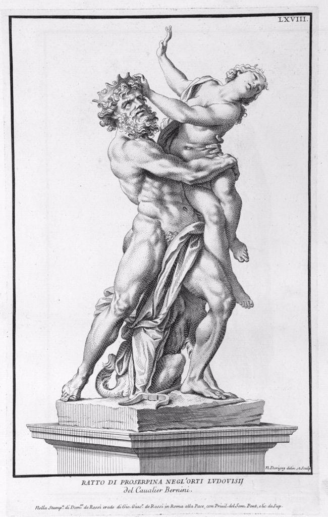
    The Rape of Proserpina has been reproduced many times in a two-dimensional format in the centuries since its creation. Nicolas Dorigny (a French-born engraver) produced an engraving of the sculpture that was published in the volume “Domenico de and Paolo Alessandro Maffei. Raccolta di statue antiche e moderne” (1704) by Domenico di’Rossi3 as plate LXVIII. This image shows Bernini’s sculpture from a three-quarters angle, centralizing more on Pluto than Proserpina. Since travel was difficult in 1704 when the engraving was published, Dorigny’s reproduction may have been the only way for an individual in England to see the work.
     

    What does a viewer lose when only seeing Bernini’s The Rape of Proserpina through Nicolas Dorigny’s engraving? For starters, only one vantage point of the sculpture is published in the 1704 volume, so readers would not have a reproduction of the back side of the figures. Any details that were carved outside of Dorigny’s reproduction vantage point would be virtually nonexistent to an individual looking at his engraving. While Dorigny’s engraving intentionally focuses on Pluto as the central figure in his reproduction—as evidenced by framing the engraving to have him as the

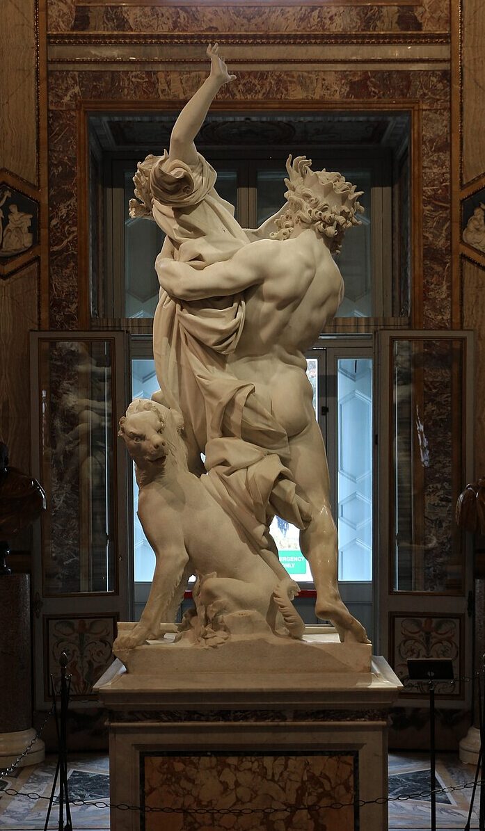
    center of the image, not Proserpina—Bernini’s sculpture when viewed from the back shifts the attention to Proserpina. From the back, she is the central figure with the highest range of motion and emotion, not Pluto. Proserpina is physically higher than Pluto is due to her outstretched arm, drawing the viewer’s eye towards her. Moreover, the intricate movements in the fabric of her clothing highlight the surprise she felt as she was suddenly abducted by Pluto, as she is clothed from the back but nude from the front—suggesting she was caught in a state of surprise. 

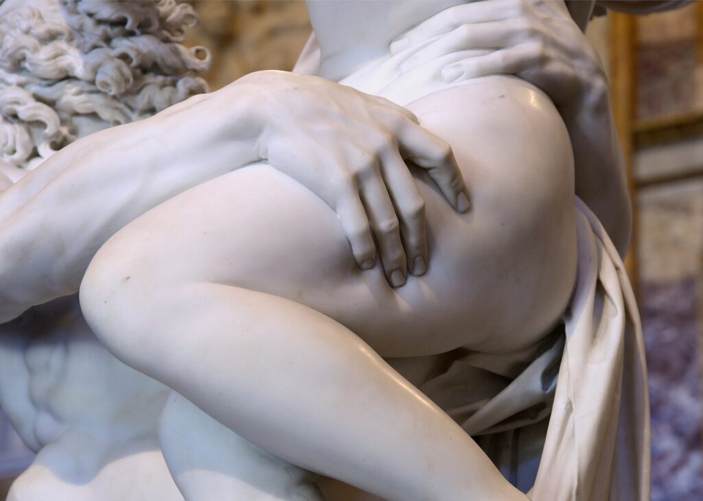
    In reproducing only one vantage point of Bernini’s The Rape of Proserpina, Nicholas Dorigny’s engraving cuts out parts of the story told by Bernini—whether intentionally or unintentionally. Viewers are forced to see the story from a single perspective, mimicking the physical viewing experience relegated to a single perspective as well. Modern photographs still do the same thing. Photographs of Bernini’s work continue to exclude certain aspects of the three-dimensional sculpture. Many images taken from the same vantage point as Dorigny’s engraving completely exclude the inclusion of Cerberus beneath Proserpina, an important contextualization for the work’s story. The pressure with which Pluto grips Proserpina is also often missing from two-dimensional reproductions of the sculpture, as indicated by the strong grip he holds on her upper left thigh. 

    In the end, while two-dimensional reproductions are often the easier and more cost-effective method of digitizing works of three-dimensional art for wider distribution (and for many years were the only method of doing so), three-dimensional methods will always prevail over two-dimensional ones in accuracy. (Accuracy here being defined as a means of fully capturing all of the details of a work of art). Photogrammetric models of Bernini’s The Rape of Proserpina have been published online, allowing viewers to see the anguish on Proserpina’s face from a better angle, as she faces towards the ceiling in the ten-foot tall sculpture. 


    For the second part of my blog post I was tasked with uploaded scans completed earlier this week in class. We completed a digitization workshop in which each student scanned an image and a body of text of their choice. Adjustments were then made to the digitized files as needed in Photoshop, including cropping and minor color adjustments (for the image) and a very-unsuccessful attempt at OCR for the (handwritten) text. Apparently my handwriting is not legible to Adobe Acrobat.

    Digitized scan of a postcard I received from a friend while she was in Athens.


    Below is a scan of my reading notes from my museum studies seminar this semester. They come from an article assigned for reading: Carol Duncan and Alan Wallach, “The Museum of Modern Art as Late Capitalist Ritual,” in Preziosi and Farago, eds., Grasping the World, Part V, chapter 1.

    I wouldn’t recommend you download them, unless you have a particular interest in Marxism and museum studies.

    1. Emma Stanford, “A Field Guide to Digital Surrogates: Evaluating and Contextualizing a Rapidly Changing Resource,” Routledge Companion, pp. 205.  ↩︎
    2. Stanford, pp.207. ↩︎
    3. Rossi, Domenico de’, “Raccolta di statue antiche e moderne: data in luce sotto i gloriosi auspici della Santita di N.S. Papa Clemente XI.” Stamperia della Pace. Rome. 1704. Available online via Internet Archive. ↩︎

  • Art Historians As Purveyors of Digital Humanities

    23 August 2026

    For my first blog post of the semester I chose to examine Alison Landmead’s “Art and Architectural History and the Performative, Mindful Practice of the Digital Humanities” (2018). I found that the article was a comprehensive, yet rightfully critical overview of the benefits and pitfalls that art and architectural historians often encounter in using visual reproductions of objects in their work. With Langmead serving as the director of the Visual Media Workshop at the University of Pittsburgh and holding faculty positions in the Department of Art and Architecture and in the School of Computing and Information, I would expect that her work in the digital humanities significantly impacts how she approaches the field. See her bio here.

    Landmead’s article begins with an overview of the different visual reproduction methods art and architecture historians have used in the past. Beginning with later slides and later adopting the 35mm film slide, art historians have long sought out reproductions of the works they study for research and classroom teaching. Unlike in English Literature for example, the corpus of work used by an art historian cannot be easily duplicated and mass produced, leading to issues of accessibility. Oftentimes art historians are working with unique pieces that are housed in museums—or worse, private collections—that cannot travel. Image reproductions in the form of slides have been essential in the field for decades to bring the corpus of work into the art historian’s office. 

    But, as Landmead herself points out, image reproductions are riddled with unexpected distortions and errors that often go unnoticed by the untrained eye. Color in particular is difficult to capture, as environmental factors such as lighting can alter the way an image in captured on film. Moreover, slides naturally degrade over time, causing colors to fade and bleed. Scale and proportions are also difficult to capture, as 35mm slides were standardized in their proportions. Two-dimensional works of art translated relatively well to slides, but any object that has texture or is three-dimensional will lose certain aspects of its depth when translated to a two-dimensional medium. 

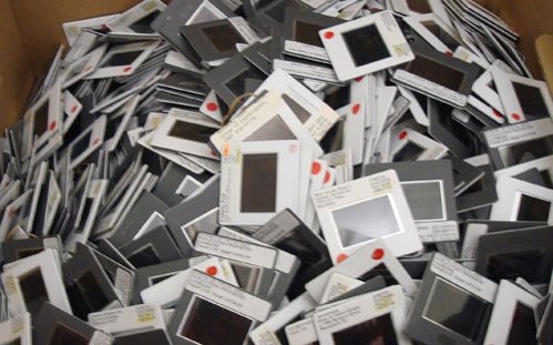
    35mm slides from the collection at the School of Visual Arts, New York, NY.

    Image courtesy of the School of Visual Arts Library’s Visual Resources Center


    The transition from 35mm film slides to digital images around the turn of the twenty-first century has brought its own challenges to image “accuracy” for art historians. Digital images require computer screens to view, which can slightly alter the colors of an image from its original. Moreover, computer screens are available at a wide array of different resolutions depending on brand, age, and price, resulting in different viewing experiences from screen to screen. A Dell monitor may show a digital image of a painting to be more cool in tone than an iMac, greatly affecting the coloring of the image and disadvantaging scholars with lower-quality or older technology. Classroom projectors face the same issue in displaying digital images for teaching. Institutions with higher budgets may elect to purchase higher-quality projectors for their classrooms, disadvantaging students and academic departments with lower budgets in their studies. 

    Beyond image accuracy, digital images bring their own preservation problems to the hands of digital humanities. While slides physically degrade over time, digital images can become corrupt or obsolete as technology advances, rendering them completely unusable. A slightly discolored 35mm slide can still be used with the caveat that it is discolored, but a corrupted digital file is oftentimes unsalvageable once damage has been done. Moreover, digital files have to be transferred from storage solution to storage solution as technology advances so they can still be accessed. This is a necessary step for researchers because as technology progresses, the systems used to access old storage solutions become more and more difficult to access. But files can become corrupt if not transferred properly, increasing the risk of losing years of visual resources. 


    Alison Langmead’s article provides an excellent case study for researchers in the humanities as a whole to incorporate the use of digital technologies in the way they conduct research. Langmead is correct in her argument that art and architectural historians have been using digital technologies for decades in their work, as there are few other disciplines in which scholars are so physically far removed from the material they study. Before the rise of lantern slides for academic use, art historians were forced to rely on “mass” produced copies (that is, more mass produced than the original works) such as prints or plaster casts for study, which were riddled with inaccuracies themselves. Gotthold Ephraim Lessing’s now fundamental “Laocoon: An Essay Upon the Limits of Painting and Poetry” (1766) is an excellent example of this. Written about the Laocöon statue group now housed in the Vatican Museums, Lessing’s essay was about a sculpture he only viewed from engravings, as he never actually travelled to Italy to see it in person. His essay was partly a response to Johann Joachim Wincklemann’s essays concerning the sculpture group (“History of Ancient Art”, 1756), but his thorough analysis of the aesthetics of the Laocöon group figures came from secondhand source materials. 


    With all this in mind, what insights can art and architectural historians provide to the humanities as a whole in regards to digital methodologies? Digital tools oftentimes increase the accessibility of bodies of evidence, allowing researchers to access them from anywhere with an Internet connection. The rise of digitized materials such as books and archives in the last twenty years have shown that if materials are more accessible people will use them. But humanities scholars can incorporate digital tools into their methodologies as well as their source materials. Scholars of literature have increasingly turned towards tools such as text mining to look for new patterns in bodies of work that would otherwise be impossible to sort through. More humanities scholars have turned towards spatial mapping in the form of geographic information systems (GIS) to analysis patterns of movement and settlement, allowing for new breakthroughs in scholarship. 

    At the end of the day, the humanities keep evolving as technology does, allowing scholars to develop new ways of thinking about their fields and sharing it.